
Back to resource library
 Slide 2
 Slide 3
 Slide 4
 Slide 5
 Slide 6
 Slide 7
 Slide 8
 Slide 9
 Slide 10
 Slide 11
 Slide 12
Slide 1 of 17
Interpreting Data from Graphs Education Presentation
16 more slides in this deck
Slide 2Slide 3Slide 4Slide 5Slide 6Slide 7Slide 8Slide 9Slide 10Slide 11Slide 12+5 moreslides

Designed by
The Team from CoolPlus
Presentation
Interpreting Data from Graphs Education Presentation
Mathematics · Presentation
Year 3DataGraphs
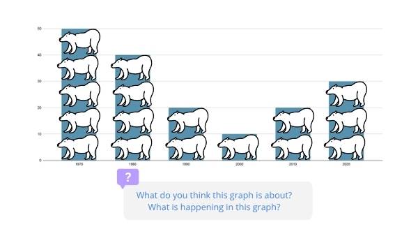
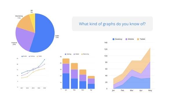
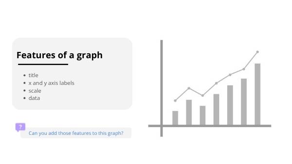
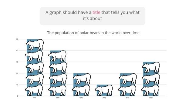
Engage Year 3 students with this interactive presentation on interpreting data from graphs. Covering bar and line graphs, axes, scale, and trends, it fosters critical thinking in statistics. Perfect for classroom application, aligning with AC9M3ST02.
Curriculum link
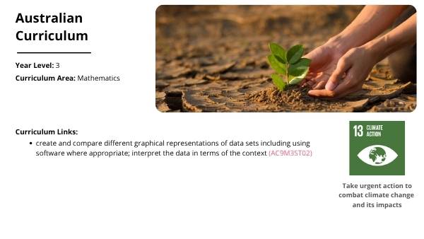
create and compare different graphical representations of data sets including using software where appropriate; interpret the data in terms of the context (AC9M3ST02)